
WYSOKA GRZĘDA
Capabilities
Brand strategy
Brand identity
Naming
Brand design
Packaging
More and more people are looking for healthy, high-quality food. However, consumers can find it difficult to navigate the variety of terms used by producers to classify eggs, including 'bio', 'eco', 'zero class' and 'free-range'.

Our task was to create a new brand that would become synonymous with exceptional quality. Our goal was for our brand to 'occupy the top shelf among the eggs'.
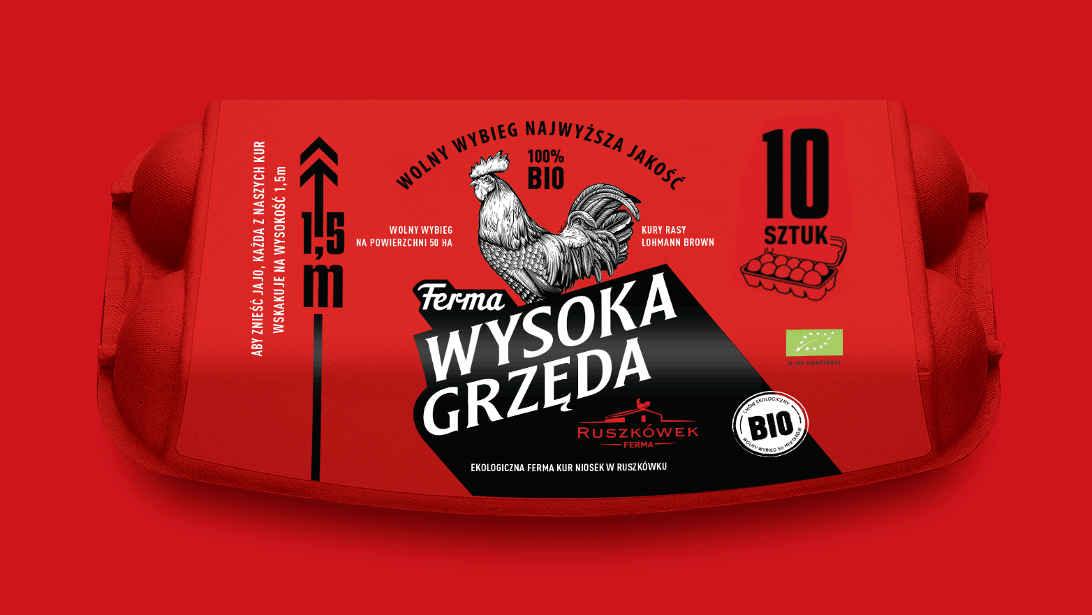
The brand’s name, High Roost, is derived from the hens’ natural behaviour. They jump onto perches up to 1.5 metres high to lay their eggs because they are healthy and strong and have plenty of freedom.
The brand logo features an illustrated rooster guarding the hen house and the quality of the eggs. The entire brand design symbolises strength and vitality, and guarantees the highest quality.
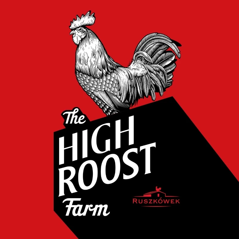
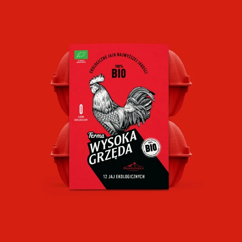
We chose the unique colour of vivid red. Red symbolises vitality and reflects the top quality of the eggs. Our brand is the 'Ferrari' of eggs.
To emphasise the brand’s identity, we created a double-decker packaging, which makes this product even more distinguishable on the store shelf.
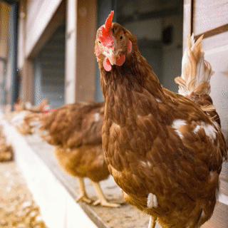
The High Roost farm in Ruszkówek, Poland, is home to Europe’s most modern and technologically advanced yet environmentally friendly hen farm. The chickens there are healthy and happy, living in free-range herds spanning over 50 hectares and eating the finest organic feed available. All of our eggs are 100% organic, have hard shells and taste delicious.
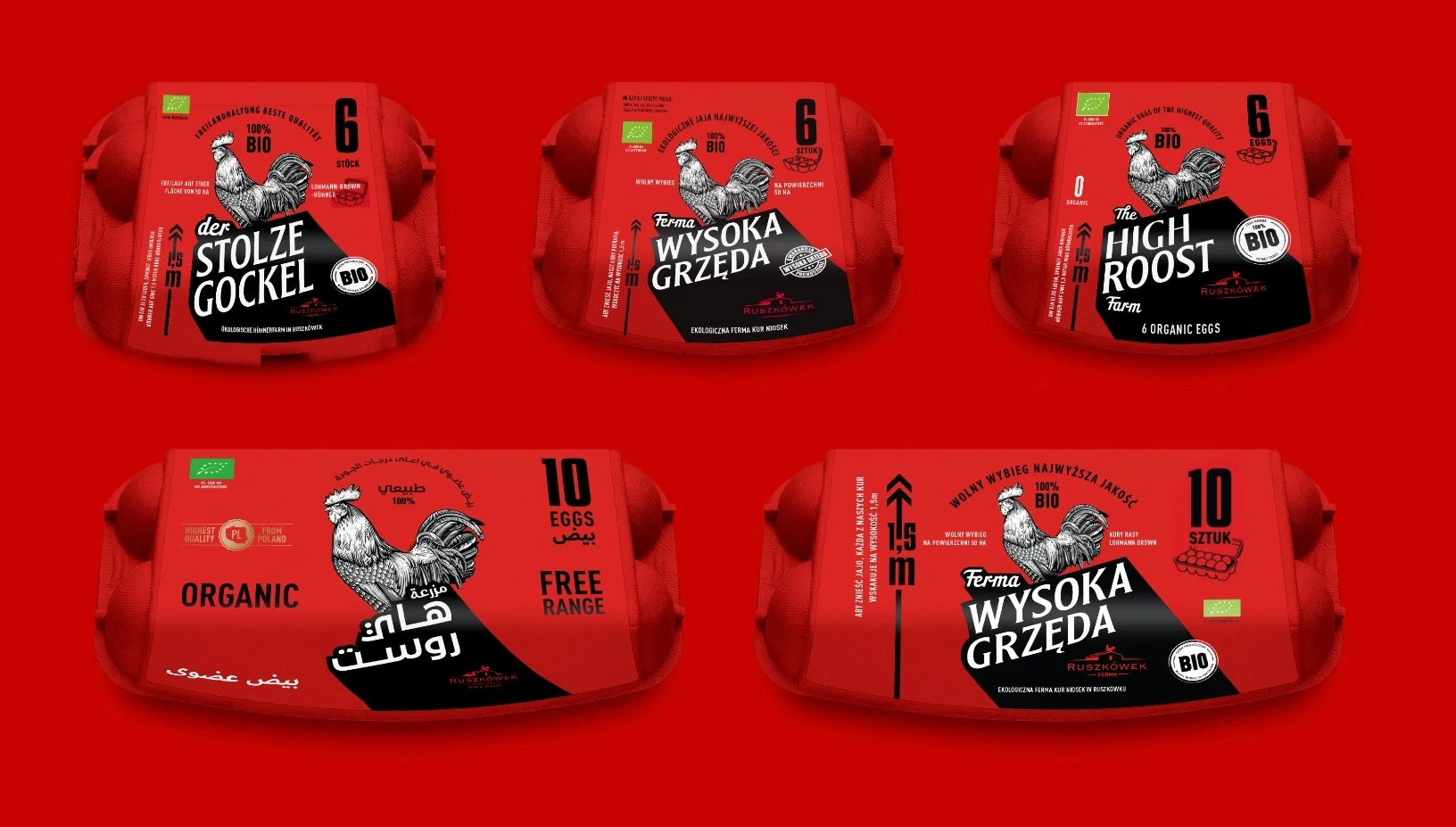
Following a highly successful brand launch in Poland, High Roost is now being introduced to international markets such as Germany, the United Kingdom and Saudi Arabia.